[Matterport Pro Tips] 5 Effective Web Designs Featuring Matterport
According to the National Association of Realtors, 92% of all home buyers begin their searches online. A well-designed website that showcases your most engaging visual content is key to catching the eye of the swelling tide of millennial and online buyers. As part of a new series, we’ll be highlighting websites which incorporate Matterport elegantly as part of a complete online property experience.
Incorporating Matterport 3D Showcase into your property marketing website is proven to increase web engagement by 3-4.5X, according to Apartments.com and Kapow.com.
Below are a few sites we love, and why we think they’re effective. Do you have an awesome website? Let us know at [email protected]!
Example 1: HouseLens.com
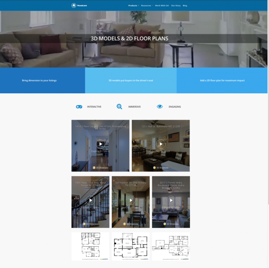
The HouseLens page dedicated to their Matterport service offering is simple, easy to navigate, and benefits-driven. They’ve embedded several 3D Spaces in a gallery-style collection, enabling online viewers to explore different Spaces at their choosing. The “hero” image for each Space is artful and unique, while the video-style play button lets online viewers know they can click through to begin their tour.
Note: The danger with embedding too many Spaces on the same page is that if a user activates each Space without closing the other, their browser may not be able to support multiple 3D tours running at once. We recommend using lightboxes when embedding multiple Spaces, just to be safe.
Example 2: ReallyThere.com
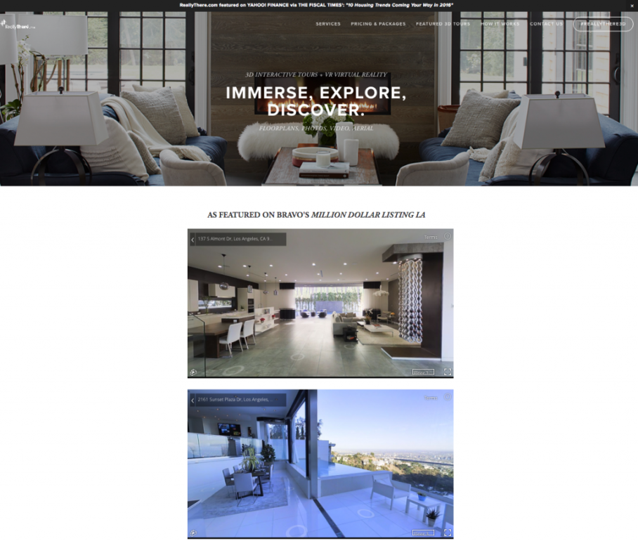
ReallyThere has embedded two Matterport Spaces directly on their website and use the “Autoplay” url parameters. This means that each Space loads as soon as a user lands on the page, encouraging them to explore as soon as they arrive. Want to learn how to use different URL parameters on your website? Download our embed guide here.
Example 3: HomeVisit.com
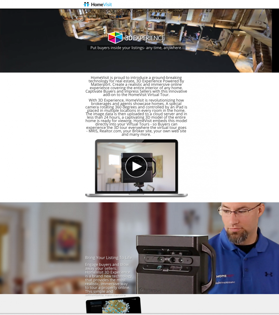
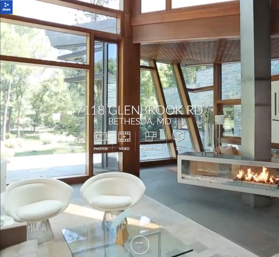
HomeVisit has put together an awesome 3D page on their website, describing the entire 3D process from start to finish. Better yet, they have added a special 3D icon which links to the Matterport Space directly from the splash screen. We recommend adding similar icons to your website, in order to drive online traffic to dedicated 3D Showcase pages for those users specifically looking for virtual tour experiences. HomeVisit also creates engaging, dedicated pages for their premier listings and often leverage Matterport’s immersive, interactive experience as the page’s closer.
Example 4: WikiBeachRealEstate.com
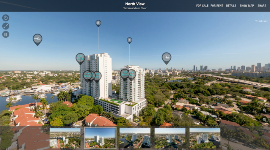
WikiBeach Real Estate uses an awesome interactive map to help users navigate to each one of their 3D Spaces, giving online visitors even more context about a Space’s location. If you manage or are selling multiple properties in a city, using an interactive map tool to link to your different Spaces could be an excellent way to drive engagement and streamline the user experience.
Example 5: Joeshoots3D.com
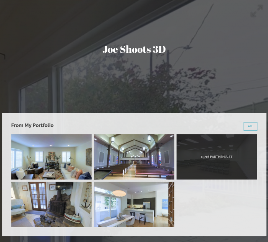
The website for Joe Shoots 3D features a great flythrough video as the backdrop for his company name (click here to see it). This backdrop flythrough teases at Matterport’s proprietary Dollhouse view and Guided Tour functionality before a user even clicks through to an embedded model. The portfolio is clean and simple, and images as links rather than embedding 3D Showcase multiple times. uses a “hover over” feature to give the address or name of the featured property.
